
Chapter one · 2018
SwedbankA chatbot for the internet bank
Bringing a chatbot into Swedbank's internet bank with no time for upfront research, by testing early and often and rewriting long FAQ answers into short replies.
Areas
- Paper sketches
- Wireframes
- Lo-fi prototype
- Hi-fi prototype
- Usability testing
- UX writing
- Workshop facilitation
At a glance
- Problem
- Add a chatbot to the internet bank, joining late, with fixed requirements and no time or budget for proper research.
- Approach
- Paper sketches with the cross-functional team, lo-fi and hi-fi prototypes, and regular usability tests that fed straight back into the sketches.
- Outcome
- A chatbot launched in 2018 based on my wireframes and test findings, with much shorter, clearer answers.
The assignment
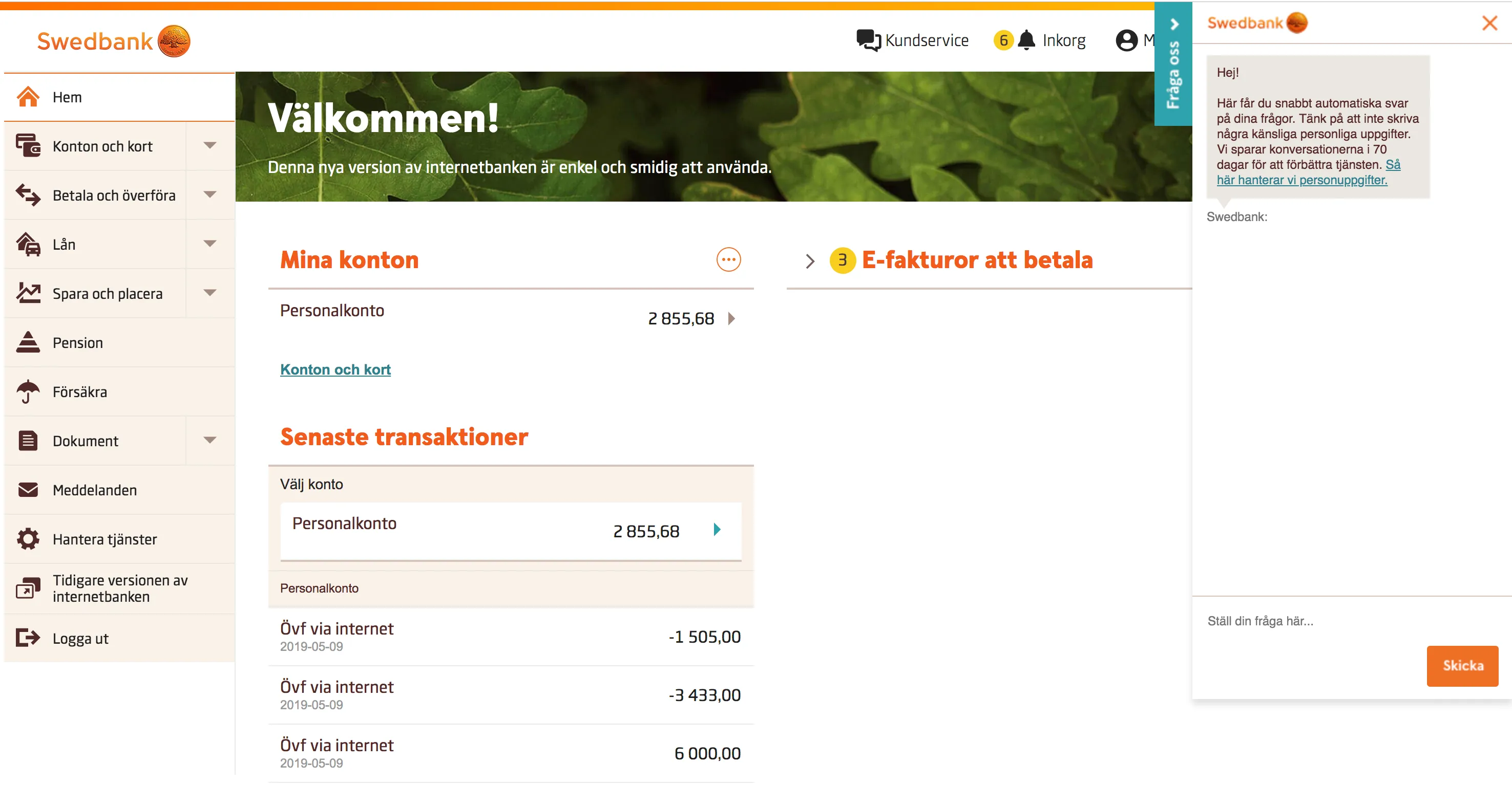
The assignment was to bring a chatbot into Swedbank’s internet bank. I shared it with another UX designer. We joined late in the project, and there was neither time nor budget for proper research and analysis. We were given detailed requirements for functionality and placement.
Sketches
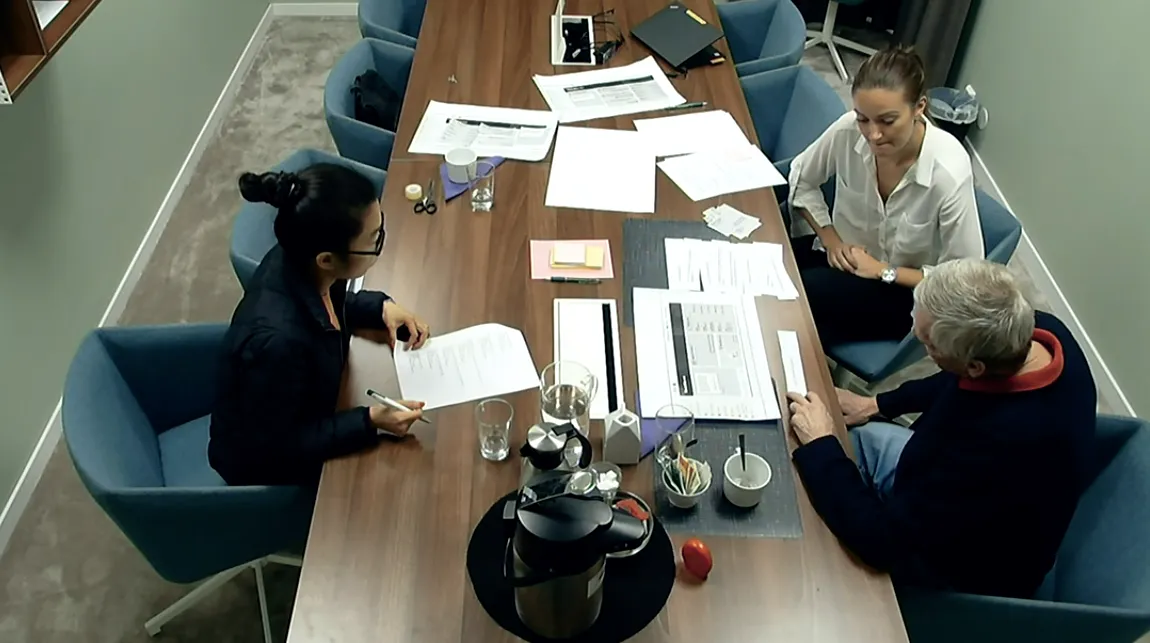
I started by sketching lo-fi prototypes with pen and paper. This was close work with the rest of the cross-functional development team, so we could check challenges and opportunities as we went.
Prototype
The paper sketches became lo-fi prototypes in Sketch. A design agency created the chatbot’s visual design. The prototype was then developed into a detailed hi-fi prototype, made clickable in InVision.
Usability testing
We ran regular usability tests with Swedbank’s customers on both the lo-fi and hi-fi prototypes. I was responsible for planning the tests and writing the scripts and test cases, and I led the interviews and tests while my colleague observed and took notes. After each round we wrote a report of the insights and presented it to the project group and stakeholders.
Iterations
After every test, the sketches were updated based on the findings. That way the design decisions rested on what users told us.
Challenges
The challenge was getting customers to use a new kind of contact channel. Many had a low opinion of chatbots after bad experiences elsewhere. The tests showed that customers would consider a chatbot for simple questions, but for more complex ones they preferred to call the bank.
That gave us the idea to also update the customer service page in the internet bank: gather all of the bank’s contact channels in one place, and guide customers to the right one depending on the help they need.
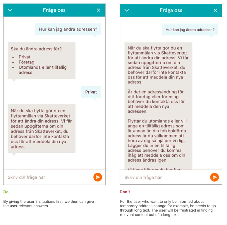
I also worked a lot on the chatbot’s written content, making the answers shorter. I argued that customers expect short, quick replies from a chat. When we started, the chatbot was more like an FAQ with very long answers. My UX colleague and I ran regular workshops with the project group to improve the chatbot’s answers, and we created do and don’t examples for the content.
Result
In 2018 the project launched a chatbot in Swedbank’s internet bank, based on my wireframes and the feedback from the usability tests. Thanks to the workshops I helped run, the chat’s content improved considerably over the course of the project.