
Chapter two · 2019
SwedbankA new concept for GDPR consents
Turning a cluttered page of consents in Swedbank's internet bank into one that stays clear despite a lot of necessary text.
Areas
- Wireframes
- Prototypes
- Usability testing
At a glance
- Problem
- The internet bank's page gathering every consent a customer had given was seen as cluttered and hard to understand.
- Approach
- Interviews and think-aloud usability tests on the existing page, paper sketches, a clickable hi-fi prototype, and a second round of tests.
- Outcome
- A tested hi-fi prototype handed to developers, followed through development with regular UX reviews.
- 8test participants, aged 18–57
- 4scenarios per test
- 40minutes per session
The assignment
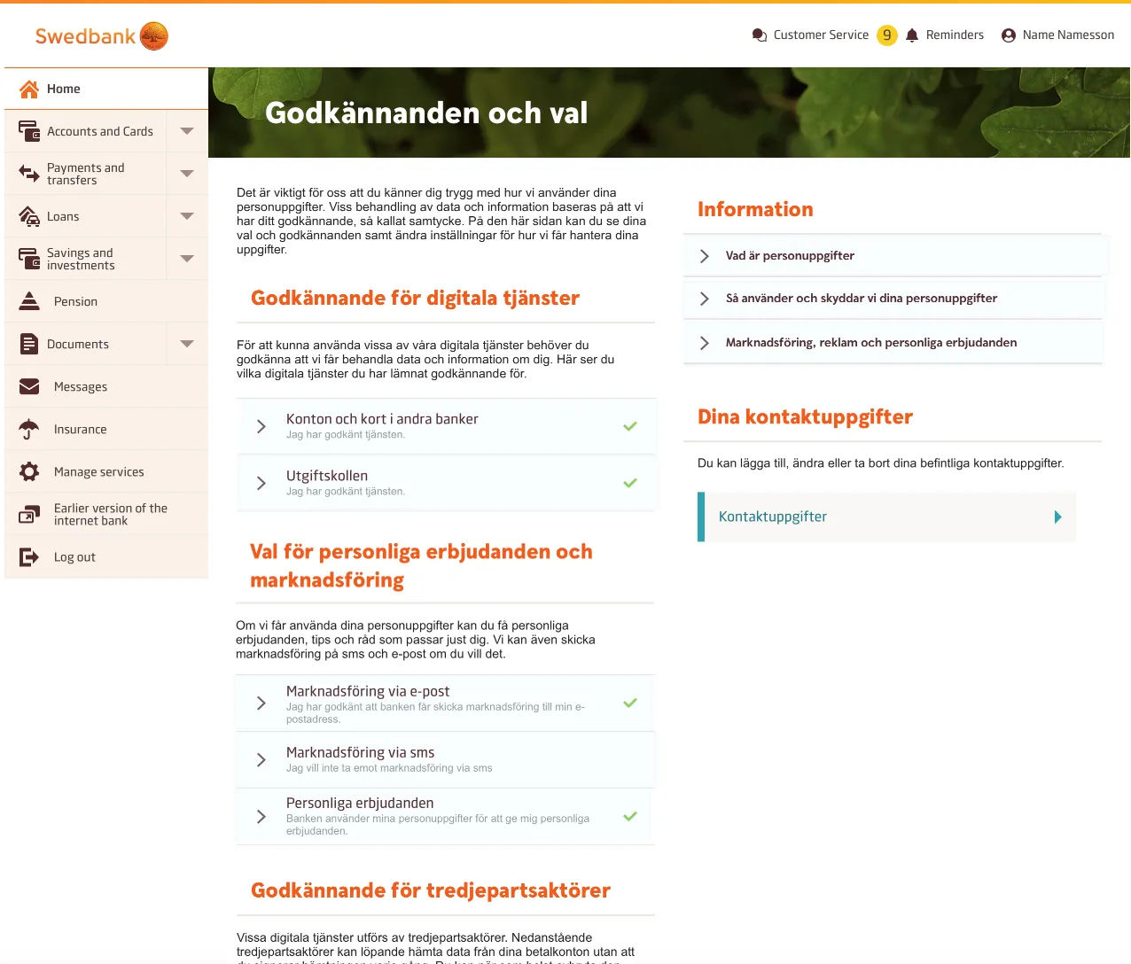
The assignment was to create a new concept for a page in Swedbank’s internet bank that gathers every consent and approval a customer has given the bank. The existing page was seen as cluttered and hard to understand, which is why the bank asked for a new concept.
Understanding the problem
To understand why the page felt cluttered, we ran interviews and usability tests on the existing page with Swedbank’s customers. The results were compiled into a report and presented to the project group and stakeholders.
Sketches
I made lo-fi paper sketches of a concept based on the customers’ feedback. I discussed them with the project group to catch obstacles as well as opportunities, and with a few customers to get their feedback.
Prototype
The paper sketches became a detailed hi-fi prototype, which I made clickable in InVision.
Usability testing
We tested the hi-fi prototype with Swedbank’s customers to validate the concept. Their feedback led to updates of the prototype before development started.
Challenge
The challenge was a concept that had to hold a lot of text and still feel simple and easy to scan. I worked closely with a UX writer to improve, shorten and structure the texts.
Result
I delivered a detailed hi-fi prototype to the developers and followed it up with regular check-ins and UX reviews during development.